(the story)
Home Passport is an app concept for Frontdoor and American Home Shield. It keeps every appliance, warranty, and repair in one place, and registers a new device with a single NFC tap.
(my role)
I worked on this with my teammate Anahi. I researched the existing appliance apps, mapped the service flows, designed the screens, built the design system, and made the physical NFC tag prototype. We presented to Frontdoor at the final review, where it was selected as a recognized proposal.
(the problem)
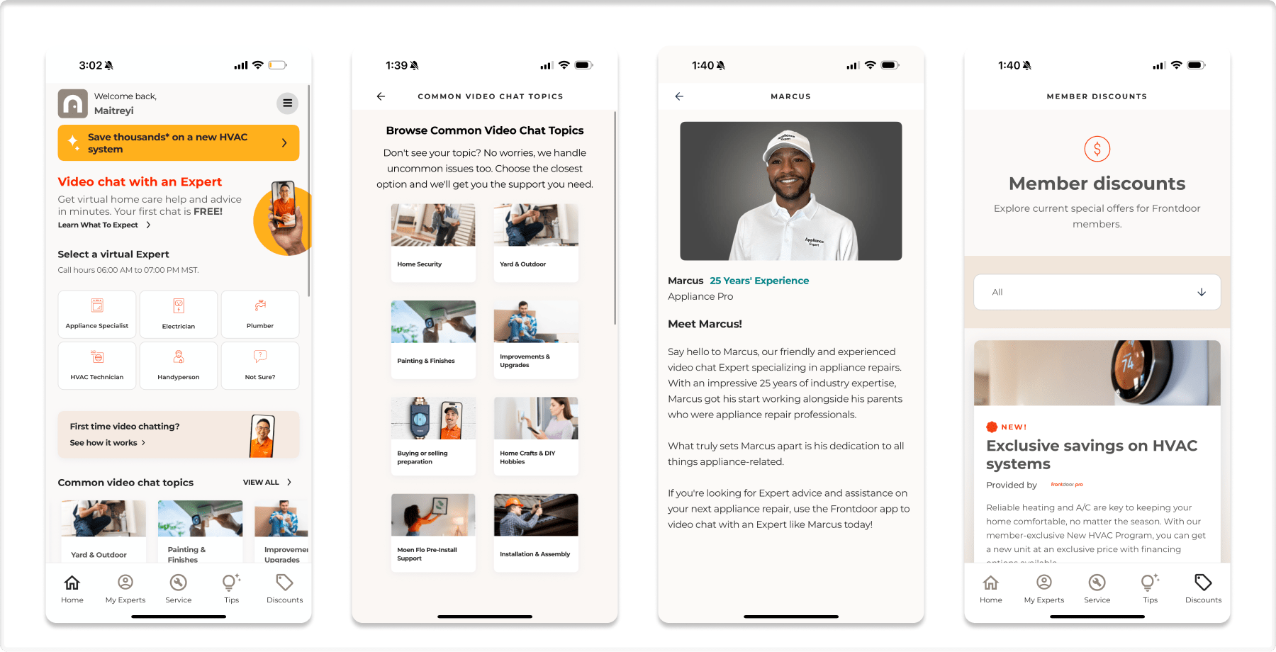
Half of U.S. homes own a smart appliance, but only about 1 in 10 ever connect it to its app. I tested LG ThinQ, Samsung SmartThings, and the current AHS app to understand why. All three ask for long forms, serial numbers, and purchase details before giving anything back. Booking one repair takes 12 steps, and the app remembers none of it next time.
The interface was never the real problem.
(1)
I set up real appliances in three apps and wrote down everything that got in the way. Each app failed in its own way, and none of them gave anything back before something broke.
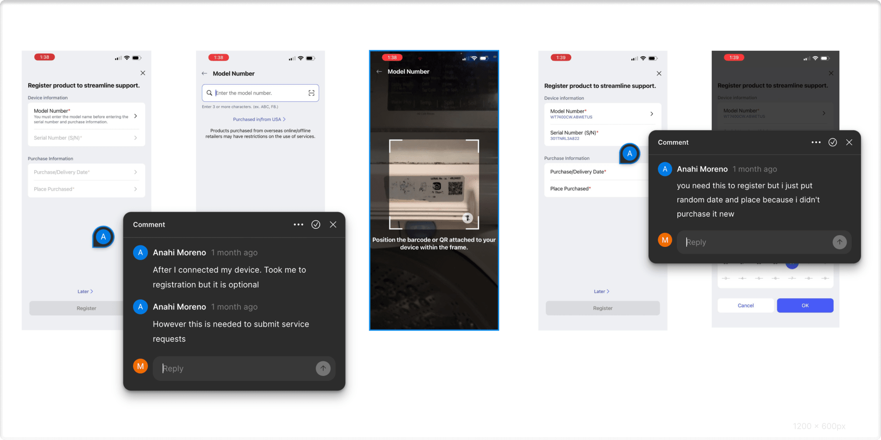
Registration looks optional until you need a repair, then it is required. Every request makes you pick brand, category, appliance, and problem again. The app remembers nothing about your home.
We tried a second-hand washer. The setup code was printed inside the machine and was smudged. The app then asked for original purchase dates a used owner does not have, so we typed in fake data just to finish.
Records belong to an account, not a house. Sell the home and the history is wiped, so the new owner gets no repair log and no appliance ages. AHS only learns what is in a house after a claim is filed.
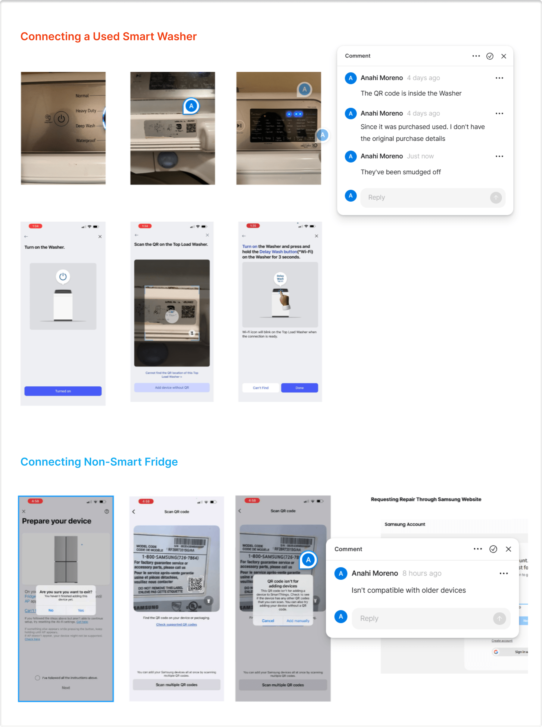
The used-washer test, a smudged QR code and no purchase details
(2)
I walked through the real flow and wrote down every screen. Twelve steps to book a single repair, and the app starts from zero the next time you come back.
Open the app, tap Request Service, search for your brand
Pick a category, pick the appliance, type the issue, enter the serial number
Confirm the address, choose a time slot, enter payment, then wait
The same four questions came back every single time. That is the real finding: the app has no memory of the home, so the work never gets easier.
(3)
None of the appliance apps had an answer, so I looked at products people register without being asked. Three of them explained why.
Scan, feel the tap, the card is ready. One motion and you get something immediately. Onboarding that does not feel like onboarding.
Service history is worth money at resale, so people keep records because the record itself is valuable to them.
Setup happens while you are unboxing, when you are most excited. Timing matters as much as the flow does.
The principle I designed against: the value has to arrive before the breakdown, not after it. Stop asking people to fill in forms. Make it a tap, and give something back the same second.
(4)
Registration had to cost nothing, so I designed it around a physical NFC tag on the appliance. Your phone touches the tag, the appliance identifies itself, and the home record updates before you open a form. Tap, confirm, done, and the record belongs to the home rather than the owner, so it survives when the house is sold.
the appliance identifies itself, no serial numbers
one screen shows device, model, and warranty
registered to the home, so the record survives owners

The tag itself, tap to connect
(5)
Once registration is free, the app has something to give back. I built the dashboard around one question: how is my home doing right now? Health first, then age, last service, and efficiency for each device. The alerts speak in money rather than error codes, your fridge coils are dusty, save $15 a month. Manuals and receipts go into a paperless drawer you can export when you sell.
condition, age, and last service for every appliance
written in dollars saved
manuals and receipts, exportable
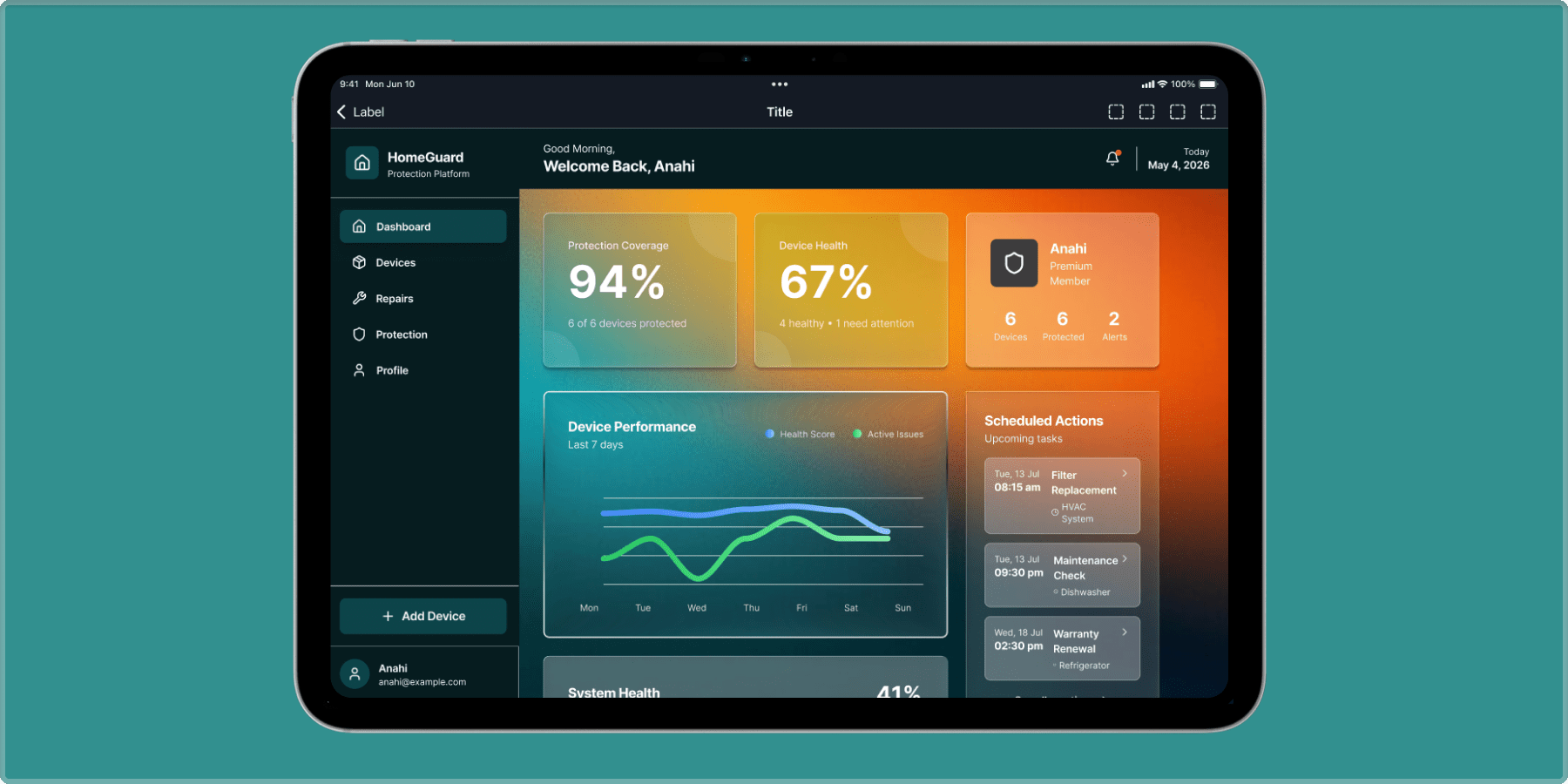
The final dashboard, appliance health at a glance
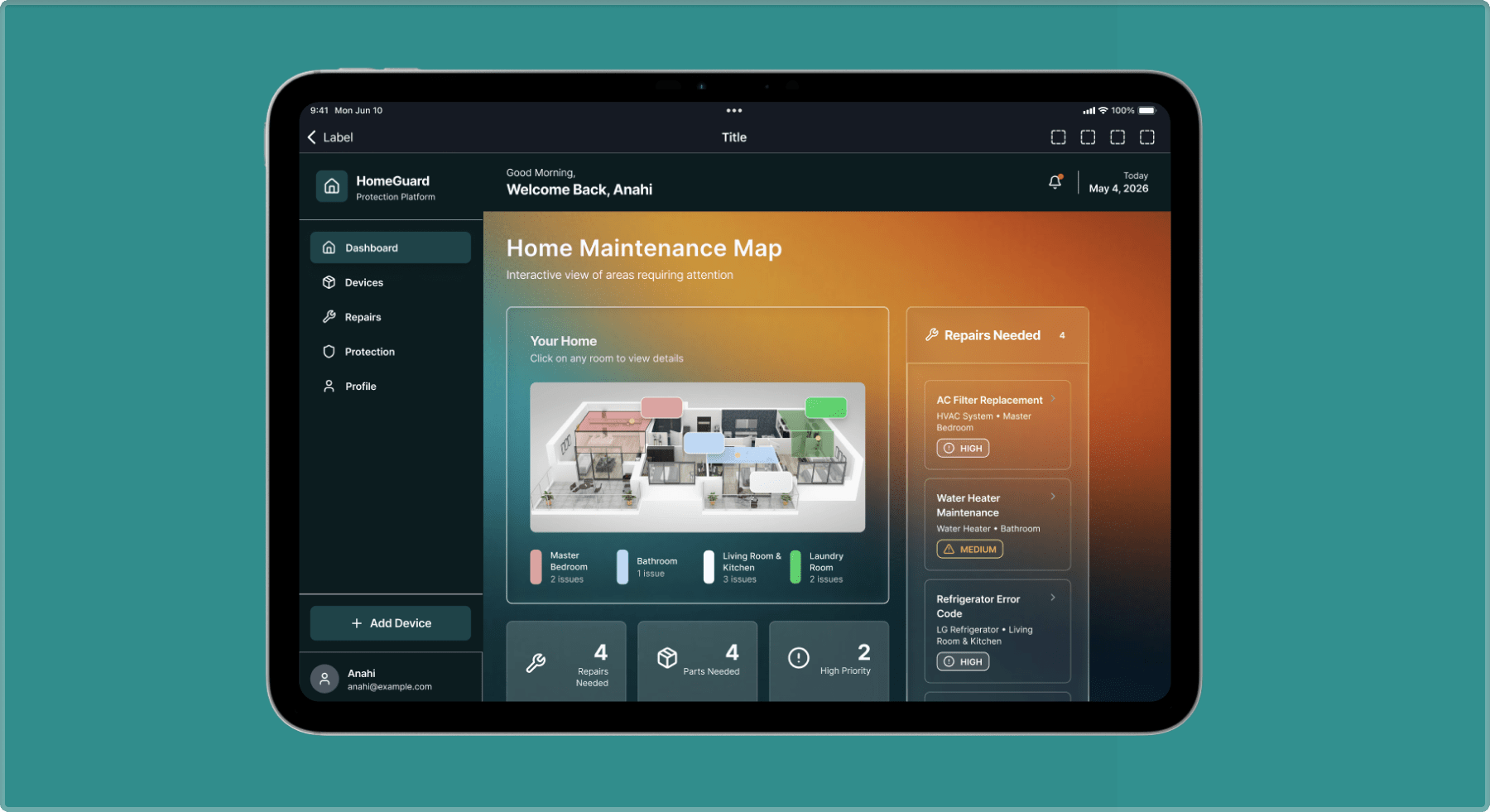
The maintenance map, repairs needed by room
(6)
Before rebuilding the design system I wanted to know what the current app actually does. I captured twenty screens of the live AHS app and logged every button, colour, and label in a spreadsheet, one row per element with its colour, size, and source screen. Then I checked each colour pair against WCAG, text against its background, borders against their surface, labels against the buttons they sit on.
Seven primary buttons came back below the standard. The same primary button appears at four different widths across four screens, and values were typed screen by screen instead of coming from one source, so nothing kept them consistent.
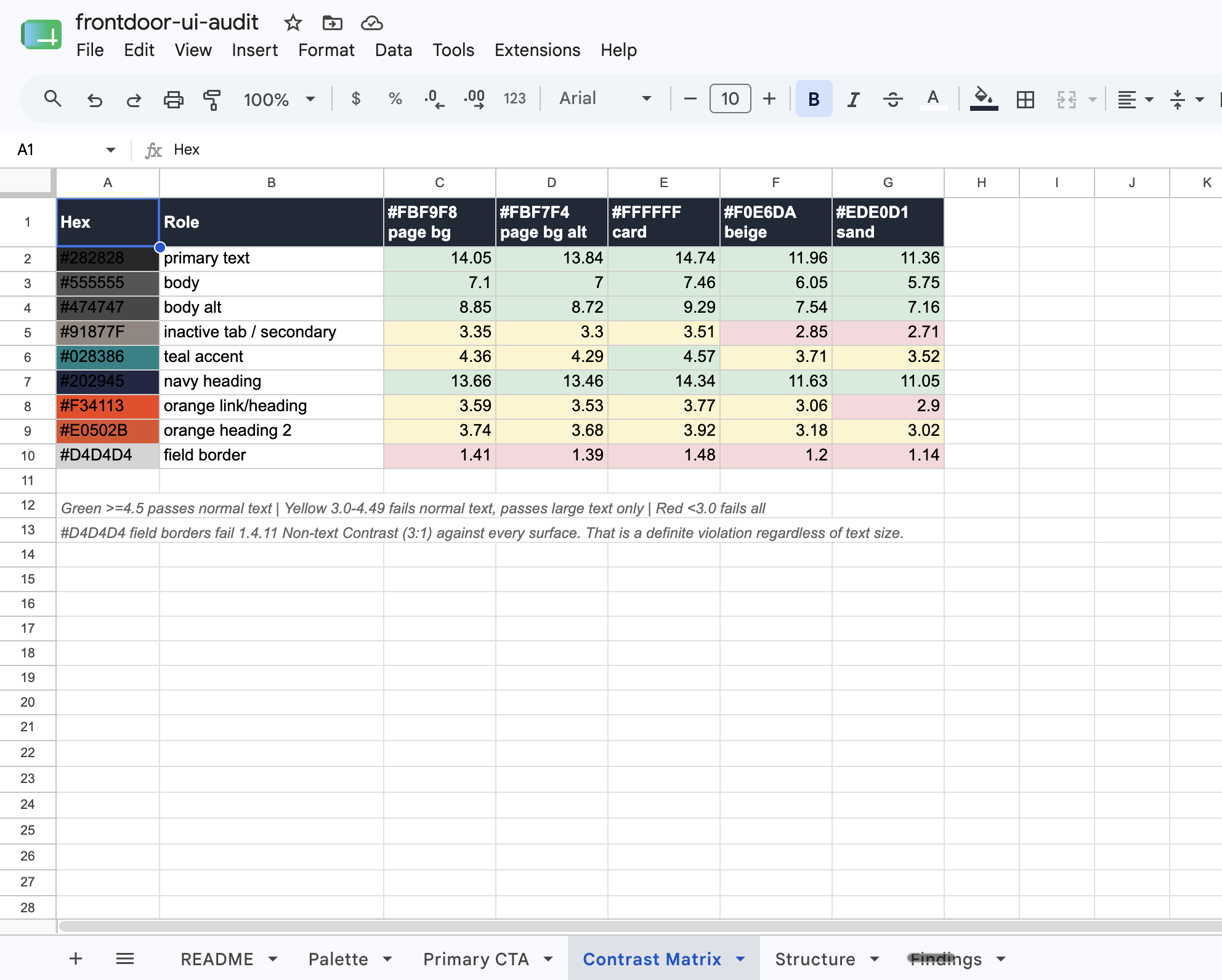
The actual spreadsheet, every colour pair scored against WCAG
(7)
AHS is orange, and orange reads as urgency, the feeling of something breaking. A home-care app needs the opposite, so I moved the palette to blue. I made that decision before the audit, for what the colour communicates. The audit then showed the orange was failing contrast anyway. Every new colour was checked against the surface it actually sits on rather than against white.
| Before | After | Contrast | |
|---|---|---|---|
| Button | #F34113 | #DA3A11 | 3.77 → 4.57 |
| Field border | #D4D4D4 | #8F8F8F | 1.48 → 3.08 |
| Small text | #91877F | #78706A | 3.35 → 4.63 |
| Second orange | #E0502B | removed | folded into the ramp |
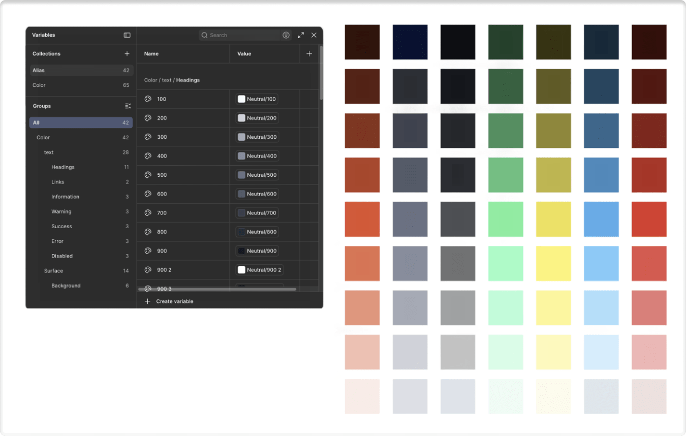
The blue ramp, built as Figma variables
(8)
A token is a named value. Instead of typing a hex code on a screen, a button asks for action.primary.bg and gets its colour from one place. I built it in three layers: base holds the raw colours, the middle layer names them by job, and components only ever ask that middle layer. Change it once and every screen follows.
#DA3A11the raw colourbase.color.blue.50named by valuepurp.color.action.primary.bgnamed by jobcomp.button.primary.bgwhat the button asks for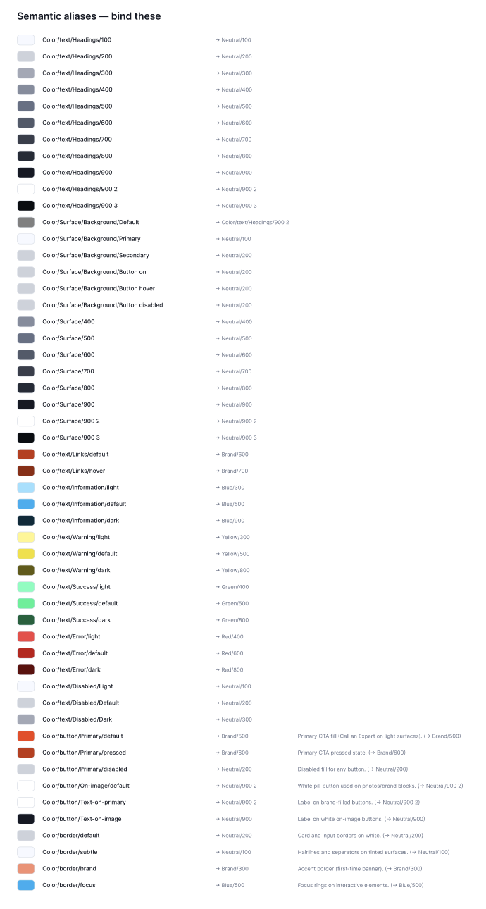
The semantic layer, one alias per role
(9)
Each component is one Figma component with properties rather than a page of copies. The button carries variant, size, and state as properties, with a boolean for the icon, so every combination comes from one master. Auto layout handles the padding and constraints handle the resize, which is why the same button works full width on a form and inline in a card.
I built them in code the same way. Variants are props, and the states are real CSS states rather than separate stories, hover is :hover, focus is :focus-visible, so you can tab to the ring instead of looking at a picture of one.
variant, size, state and icon on one master
the same component holds at any width
hover, focus, active, disabled, loading
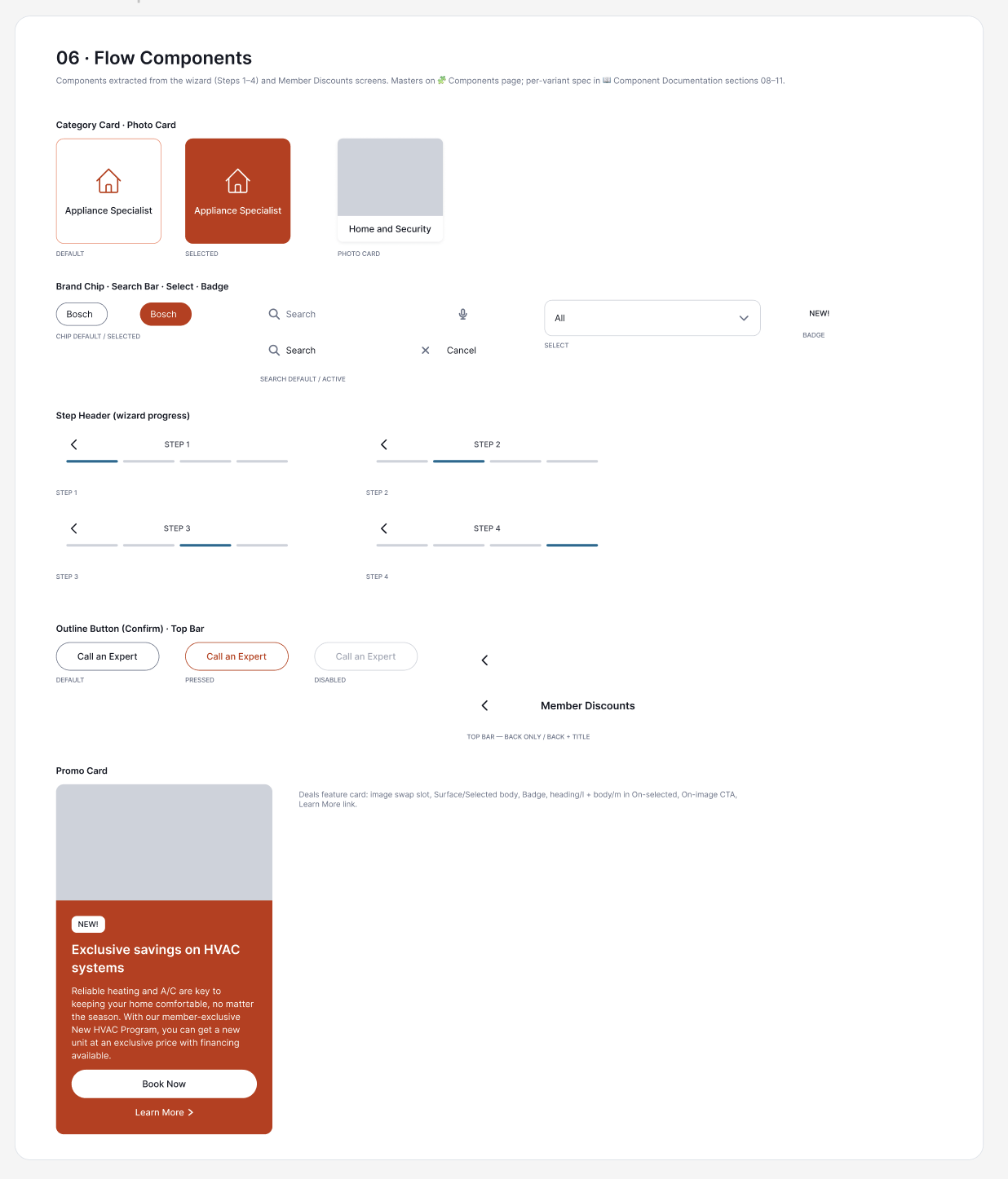
Category cards, chips, search states, buttons, one master each
(10)
Figma pushes to GitHub. One file becomes CSS, Swift, and Android XML. Before anything ships, the system checks every colour pair against the accessibility standard and stops if one fails. I put the old orange back to confirm it stops, it did, naming the exact colour and the exact ratio. It also caught two colours I had approved myself, they cleared white but failed against the page background.
FAIL  3.77:1  (needs 4.5)
purp-color-action-primary-fg #ffffff
  on purp-color-action-primary-bg #f34113

Contrast gate FAILED: 1 violation(s).
(11)
The components run in Storybook, one page each, with every variant and state. The controls panel lets anyone switch variant, size, or state without opening the code. Storybook is embedded in Zeroheight, where the usage rules sit next to the live component, when to use it, when not to, and the accessibility notes.
every component, every state, running
usage rules beside the live component
how a request comes in, who decides, what gets turned down
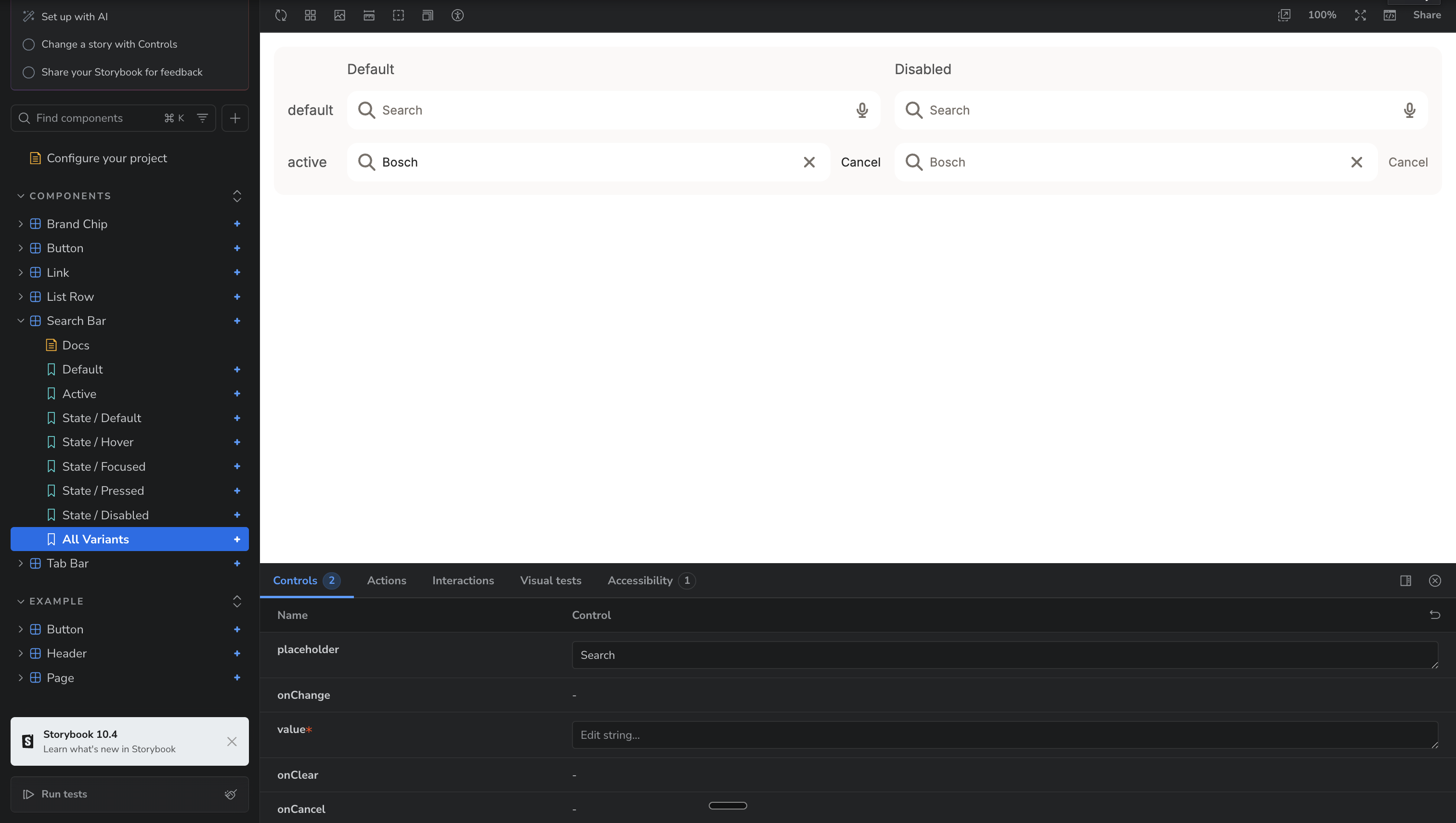
The search bar in Storybook, every variant and state from one component
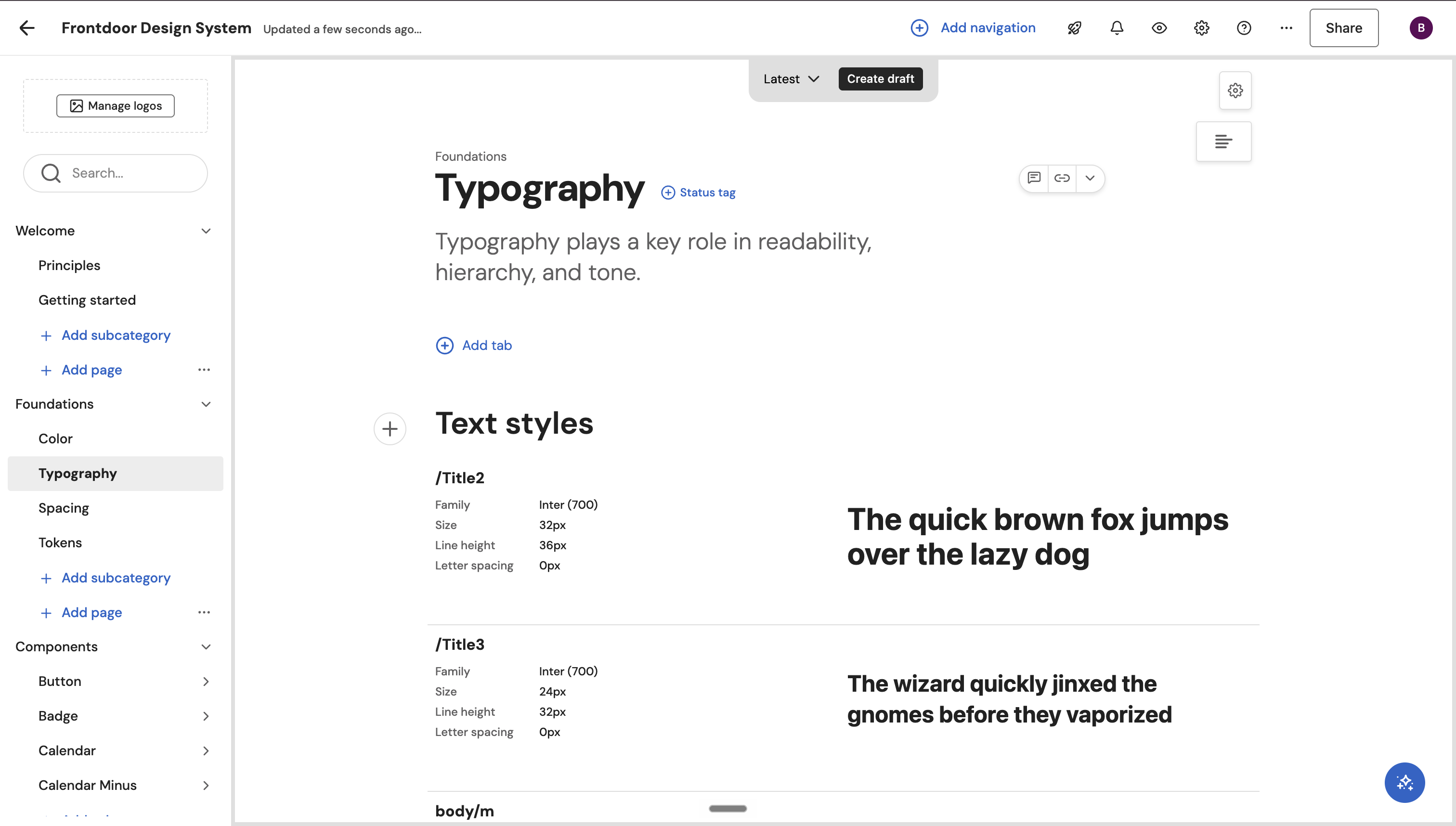
Foundations documented in Zeroheight
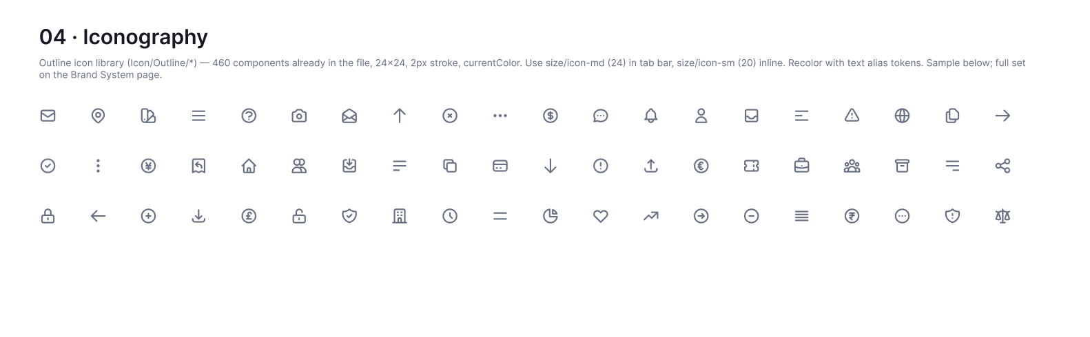
460 icons, one outline library, recolored with text alias tokens
(the outcome)
What I took away: this was an incentive problem, not a UI problem. A good interface at the wrong moment still fails. Home services will not be won by who fixes things fastest, but by who knows your home best before anything breaks.
The dashboard, where it all started and ended
Independent concept, not commissioned by Frontdoor, Inc. Audit covers iOS only, no Android, no web, and none of Frontdoor's other brands. Type sizes estimated from cap height at roughly ±1pt. Recognized at final review; I have no visibility into what happened after.
Next project: Vibin →